

Choosing Gemstones
- Kim
- Mar 5
- 3 min read
After a long, wet winter, it’s been nice to see the first signs of spring in the garden again. A few early flowers have started adding small pops of colour, and those little changes always seem to bring a bit of fresh energy back into my workspace too. When I start choosing gemstones for new pieces, I get a similar feeling — the colours, textures, and small details help me focus and begin shaping ideas for the pieces I’ll be working on next.

Starting with Colour
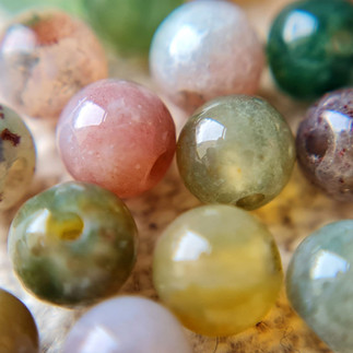
Colour is usually the first thing that catches my attention. I tend to reach for softer, earthy tones — amazonite, jade, labradorite — the kinds of shades that sit naturally with copper’s warmth. They create a calm base to design around, and they often lead to pieces that feel balanced and understated.
I also like having a few brighter stones on the bench, such as turquoise, kyanite, or aventurine, they add a welcome boost of colour when I need it. This shift in tone can add more vibrancy to a design or help create a clearer focal point.
Once I’ve chosen a gemstone, the rest of the design usually starts to fall into place. It sets the mood and quietly guides decisions about texture, finish, and the scale of the setting.
Stones with Character
I’ve always been drawn to stones with a bit of character. Moss agate is a good example — those soft patterns of cream, green‑grey, and black that look almost like tiny landscapes. Blue jasper has a similar appeal, with its marbled tones that sit between ocean colours and warm earth.
Stones like these work well with handmade metalwork because they already have their own story. Copper carries its own marks too — the subtle textures, the warmth, the evidence of being shaped by hand — and characterful stones tend to sit comfortably alongside that. They don’t need anything elaborate — often a simple bezel setting or a softly textured frame is enough to enhance those natural patterns.
When I’m selecting stones, I often look for small quirks or natural variations. They’re usually the details that spark the design.


Letting the Stone Lead the Design
After choosing a stone, the design usually starts to form around it. Translucent or iridescent stones often call for a setting that lets the light through or catches it at the right angle, so I tend to keep the metalwork a little lighter or more open. Opaque stones usually suit a different approach — something with more texture or a slightly heavier frame, where the metal can add interest without competing with the stone itself.
A lot of this comes from handling the stone — holding it against different textures, turning it in the light, trying a few orientations. And sometimes the design changes halfway through once I start shaping the metal — the stone might look better rotated, or a different finish might bring out a detail I hadn’t noticed at first.
Working this way keeps things flexible and intuitive. It feels more like a conversation with the materials than a plan I’m trying to force.
My Current Palette
I’ve got a few cabochons on the bench at the moment — the soothing green of amazonite, the delicate rose pink of rose quartz, the soft tones of sea glass, and the vibrant patterns of mohave turquoise. All of them sit so comfortably with copper and brass. They echo my creative mood, with a gentle pop of colour that feels perfectly in tune with spring.
Mostly, I’m letting myself go with that instinctive “yes” when a stone catches my eye. Even if I don’t know what it will become yet, the design always reveals itself in its own time.

Choosing gemstones is an instinctive part of my process, and it shapes so many of the decisions that follow. Each stone brings its own mood and its own story, and I love letting those details guide the design.
As spring arrives, I’m excited to welcome a few new stones and colours to the bench and see where they lead me next.
If you’d like to explore more of the stones I use, you can find my current gemstone collection here.


Comments